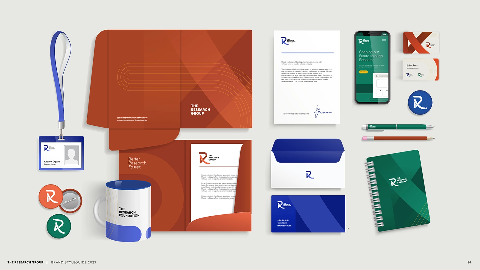
The Research Group Brand Identity
The Research Group develops software that improves the quality and speed of scientific research. Its nonprofit arm provides financial support, academic access, and support services to scholarship recipients globally.
The organization needed a naming and branding system that brought its three entities together while giving each room to stand out.
Delivery
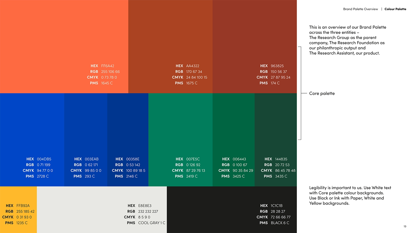
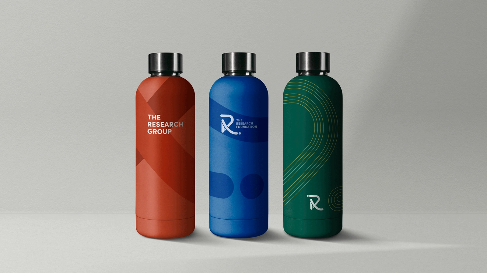
Together, we built a brand system around the “three Rs,” connecting the parent company, its SaaS research tool for academics, and its nonprofit foundation for students:
- The Research Group
- The Research Assistant
- The Research Foundation
The letter R became the visual anchor, with details that invited a closer look. The Research Assistant’s acronym, TRA, sits inside the R icon alongside the Japanese character for person (人).
Within the logos, the dot’s position traces the data journey, representing its input and output.
Project Achievements
The identity gave the startup a flexible foundation for growth. Straightforward visual guidelines made the system easy to use and adapt as the organization evolves.